Reporting Redefined

Through interviewing users, I found that the internal reporting process for performance marketing involved manual data entry into excel, had to be completed by the first of each month and could take up to a full work day to complete.
Role
Deliverables
Lead UX/UI Designer
Workshop Facilitator
User Personas
User Journey Maps
Wireframe Report
Finalized Report
Usability Tests
Fully Connected Dashboard

Janine is a marketing expert and our target user. She expressed that a report could take up to a full day of work and she can have up to 5 clients wanting a report at the start of each month. This applied to all the offline marketing teams as well.
The previous reporting process

Key issues in the reporting process
Inconsistent use of template for reports
Manual Data Entry (Error Prone and time consuming)
Formatting Data and creating Charts
Manually Exporting and emailing to clients
Can you imagine 8 hours of date entry and clean up in excel, every month for each of your clients? Me neither.
I facilitated weekly workshops via Miro with our Product Team and internal users. These workshops were crucial to the process.
Audited current reports and noted the most common data points
Collaborate with our internal users to organize these pieces into cohesive views to help them tell the story of the performance
Split the report into sections to reduce cognitive load and increase the organization of the report
Iterated until there was a single report that could be used across the company and then took it to testing with users and clients.

Prototyping
Based on the workshops, I put together a prototype to bring to users for feedback.
You can see below it still looks and feels like the previous report, which was well noted by users.

These prototypes validated the idea of splitting up report into views and the various KPIs to be show on each screen.
User feedback included:
Change of style for new UI, especially in color and layout.
Removing text boxes so users could present their findings on their call
Updates to KPIs and types of charts used on various views
Updates to the navigation
You can view the final results from the feedback below.
5-Step Marketing Funnel
Budget breakdown by day
Key KPI metrics compared to previous month and the same month of the previous year
Ability to adjust reporting period and campaign
Ability to toggle between various KPIs via dropdown.
Clear distinction between channel types (Awareness, Volume and Frequency)
Tooltip to display exact amount on hover.

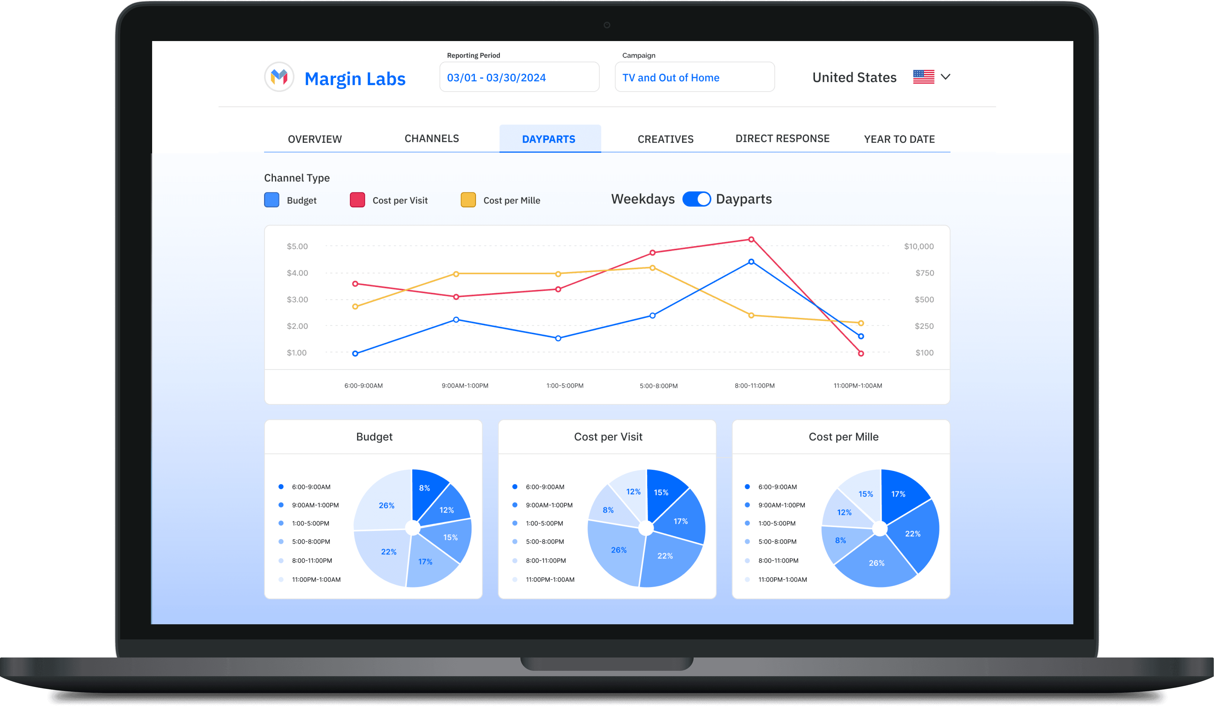
Toggle between dayparts and weekdays.
Timeline view to see how budget and conversions fluctuated throughout a day.
Breakdown of splits for key KPIs.
Conclusions and takeaways
Hours of manual excel work was saved
Unified report across the company
Digital report is shareable and accessible for clients
Internal users can analyze and bring better insights on performance to clients